
Utah 2034 Olympic Logo Elements Explained
SALT LAKE CITY — Last week at the Salt Lake City International Airport, the Utah 2034 Olympic and Paralympic branding and logo made its first public appearance, drawing cheers from a gathering crowd.
Online, the response was far more mixed.
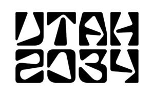
Utah 2034 logo. (Utah 2034)
Images of the logo spread quickly across social media, with many expressing confusion, frustration, or disappointment. Some noted that the wordmark, or font, was difficult to read, while others questioned whether it truly captured the spirit of the Olympics.
Meaning Behind the Design
Molly Mazzolini, the creative mind behind the Utah 2034 branding, emphasized that the design carries a depth of meaning beyond first impressions.

“Designing a logo is about more than just a visual,” Mazzolini said. “It’s about representing voices, history, and the essence of Utah.”
She acknowledged the strong opinions online but explained that bold designs often invite debate.
“People will always have subjective reactions,” she said. “But the more someone understands the meaning behind the design, the more they tend to connect with it.”

Elements of the Logo
Mazzolini and her team worked to incorporate elements representing Utah’s landscape and culture:
-
The “A” in “Utah” mirrors Delicate Arch, one of the state’s most iconic landmarks.
-
The curve inside the zero draws inspiration from Utah’s ancient rock art, including petroglyphs and pictographs.
-
The angle in the “4” is modeled after a bend in a mountain road, a nod to Utah’s canyons and outdoor recreation.
-
The “3” represents Reflection Canyon at Lake Powell.
-
The logo’s stacking and spacing follow the grid layout seen in many Utah towns and cities.
Mazzolini noted that while some critics argue a logo shouldn’t require explanation, the design intentionally blends meaning with aesthetic.
“As creatives, we consider feedback, but we also step back to view our work neutrally,” she said. “That’s how we deliver the best results.”

Designer Experience and Perspective
Mazzolini has extensive experience creating branding for major sporting events, including NFL Super Bowls and NCAA football playoffs. She sees the strong reactions to the Utah 2034 logo as typical for large-scale projects.
“Whether it’s sports, entertainment, or a brand, public reactions to logos are always part of the process,” she said.
Color Choice and Accessibility
Some online critiques focused on the black-and-white design. Mazzolini explained that high-contrast visuals help athletes with visual impairments, following guidance from Paralympic representatives.
Temporary Logo
It’s important to note that this is a transitional logo. Los Angeles 2028 retains rights to all U.S. Olympic and Paralympic branding until its Games conclude. The Utah 2034 design serves as a placeholder while public engagement and planning continue.
“A transitional logo allows us to establish an identity while adhering to International Olympic Committee guidelines,” Mazzolini said.
The permanent Utah 2034 branding, including color, is expected in 2029 after the LA28 Games conclude. The design may continue to evolve leading up to the Opening Ceremony.

Public Engagement and Excitement
Mazzolini said she has enjoyed seeing the public interact with the logo, especially younger generations who didn’t experience the excitement of the 2002 Winter Olympics in Salt Lake City.
“Kids were taking pictures and enjoying the artwork, and that’s exactly what we hoped for,” she said. “We want everyone to connect with the brand and make it their own.”
The transitional logo will remain visible at public events, Utah Olympic venues, and official Utah 2034 committee meetings, with merchandise already available for fans.
As online discussions continue, Mazzolini remains encouraged and focused on representing Utah authentically.
Connect With STG Direct